9 Data visualization
When in RStudio, quickly jump to this page by using
r3::open_data_visualization().
Session objectives:
- Learn and apply the basics of creating publication-quality graphs
- Learn about the importance of considering the colours you use in your graphs, and apply tools that are colour-blind friendly
- Learn about and avoid using certain commonly used, but inappropriate graphs for presenting results
- Create useful graphs such as boxplots, scatterplots, line graphs, jitter plots, and (appropriate) barplots
9.1 Basic principles for creating graphs
Please take ~10 min to read through this section, as well as the next one.
Making graphs in R is surprisingly easy and can be done with very little code. Because of the ease with which to make them, this gives you time to reason about why you are making them, if the graph is the most appropriate for the data or results, and how you can design your graphs to be as accessible and understandable as possible.
To start, here are some tips for making a graph (there are excellent online books on this that are included in the resources chapter:
- Whenever possible or reasonable, show raw data values rather than summaries (e.g. means)
- Though commonly used in scientific papers, avoid barplots with means and error bars as they greatly misrepresent the data (we’ll cover why later)
- Use colour to 1) highlight and enhance your message and 2) to make the plot visually appealing
- Use a colour-blind friendly palette so the plot is more accessible to others (more on this later)
9.2 Basic structure of using ggplot2
ggplot2 is an implementation of the “Grammar of Graphics” (gg). This is a powerful approach to creating plots because it provides a set of structured rules (a “grammar”) that allow you to expressively describe components (or “layers”) of a graph. Because you are able to describe the components, it makes it easier to then implement those “descriptions” into creating a graph. There are at least four aspects to using ggplot2 that relate to its “grammar”:
- Aesthetics,
aes(): How data are mapped to the plot, for instance, what data to put on the x axis, on the y axis, and/or whether to use a colour for a variable. - Geometries,
geom_functions: The visual representation of the data, as a layer. This tells ggplot2 how the aesthetics should be visualized. For instance, should they be shown as points, lines, boxes, bins, or bars? - Scales,
scale_functions: These control the visual properties of thegeom_layers. For instance, to modify the appearance of the axes, to change the colour of dots from red to blue, or to use a different colour palette entirely. - Themes,
theme_functions ortheme(): Directly controls all other aspects of the plot. For instance, control the size, font, and angle of axis text. Or maybe change the thickness or colour of the axis lines.
There is a massive amount of features in ggplot2.
Thankfully, ggplot2 was specifically designed to make it easy to find
and use its functions and settings using tab auto-completion.
As an example, if you type out geom_ and then hit tab,
you will get a list of all the geoms available.
Likewise with scale_ and all the options inside theme()
(e.g. type out theme(axis. and then hit tab,
and a list of theme settings related to the axis will pop up).
ggplot2 also works best with tidy data and with data in the long format.
So, why do we teach ggplot2 and not base R plotting? Base R plotting functionality is quite good and you can make really nice, publication-quality graphs. However, there are several major limitations to base R plots from a beginner and a user-interface perspective:
- Function and argument naming and documentation are inconsistent
and opaque (e.g. the
cexargument, in certain but not all functions, magnifies text and symbols, but you can’t tell from the name that it does that) - User-friendly documentation that is accessible to a broad range of people is not much of a priority, so often the help documentation isn’t written with beginners in mind
- Graphs are built similar to painting on a canvas: Make a mistake and you need to start all over (e.g. restart R)
These limitations are due to the fact that base R plotting was developed:
- By different people over different periods of time
- By people who were/are mostly in statistics and maths
- By people who (generally) don’t have training in principles of software user-design, user-interface, or engineering
- Without a strong “design philosophy” to guide development
- During a time when auto-completion didn’t really exist or was sub-optimal, so short function and object names were more important than they are today
On the other hand, ggplot2:
- Has excellent documentation for help and learning
- Has a strong design philosophy that makes it easier to use
- Works in “layers”, so you don’t have to start over if you make a mistake
- Works very well with auto-completion
- Function and argument naming is consistent and descriptive (in plain English)
These are the reasons we teach and use ggplot2.
9.3 Graph individual variables
Very often you want to get a sense of your data, one variable (i.e. one column in a data frame) at a time. You create these plots to see the distribution of a variable and visually inspect the data for any problems. There are several ways of plotting continuous variables (e.g. weight, height) in ggplot2. For discrete variables (e.g. “male” and “female”), there is really only one way.
You may notice that since the data wrangling chapter,
we used the word “column” to describe the columns in the data frame,
but now we’re saying “variable”.
There’s a reason for this: ggplot2 really only works with tidy data.
And if we recall from the definition of tidy data,
it is made up of “variables” (columns) and “observations” (rows) of a data frame.
To us, a “variable” is something that we are interested in analyzing or visualizing,
and that contains only values relevant to that measurement
(e.g. a Weight variable must only contain values for weight).
The NHANES dataset is already pretty tidy:
Rows are participants at the survey year,
columns are the variables that were measured.
So, from now on, we call them “variables”.
Ok, let’s visually explore our data.
Open the previously used R Project,
then open the visualization-session.R script in the R/ folder.
This script we will use for the code-along, but not for the exercises.
First, let’s add this to the top of the script:
# load packages
source(here::here("R/package-loading.R"))
Since BMI is a strong risk factor for diabetes, let’s check out its distribution.
To show distributions, there are two good geoms:
geom_density() and geom_histogram().
# create density plot for BMI
ggplot(NHANES, aes(x = BMI)) +
    geom_density()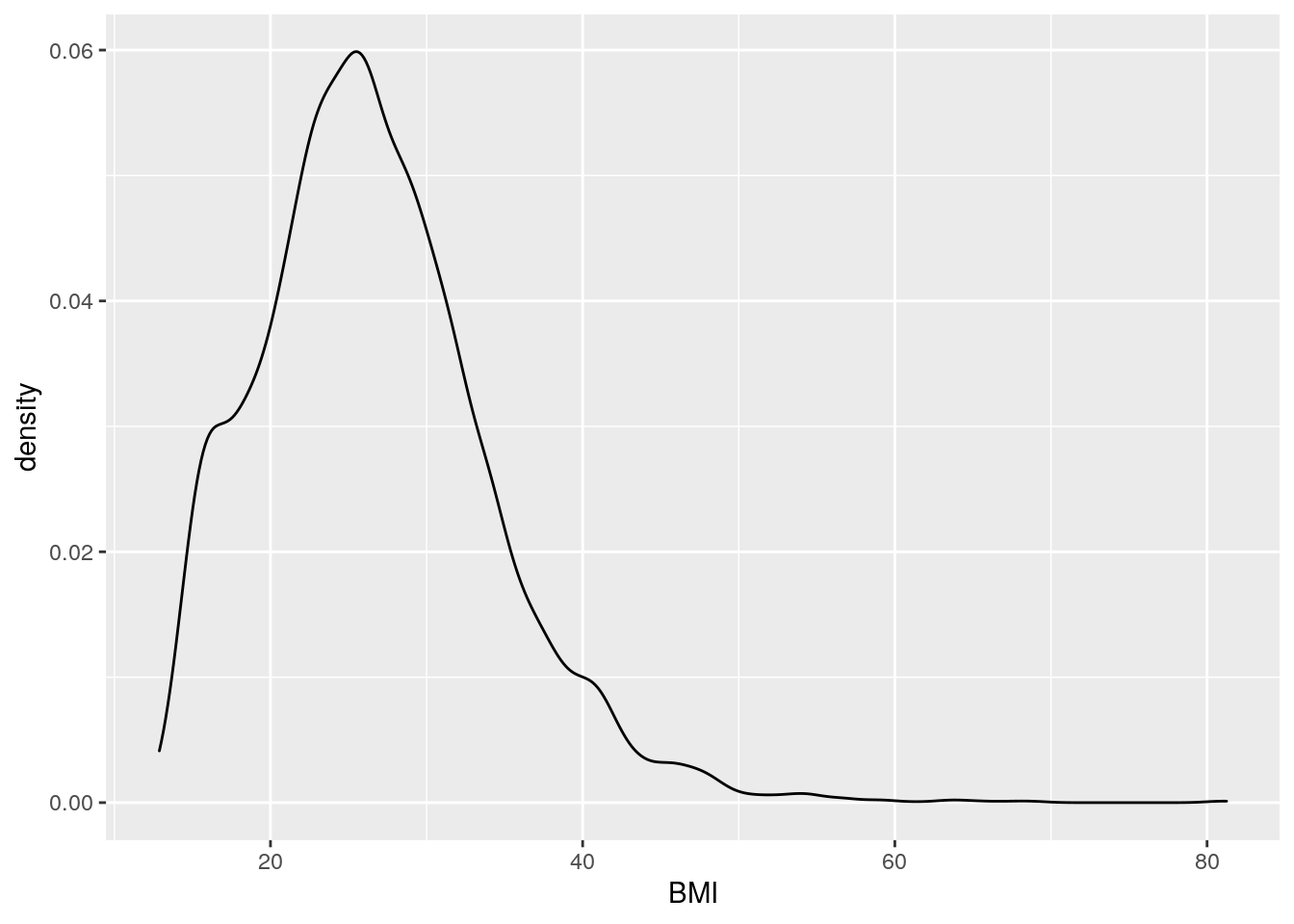
# create histogram for BMI
ggplot(NHANES, aes(x = BMI)) +
    geom_histogram()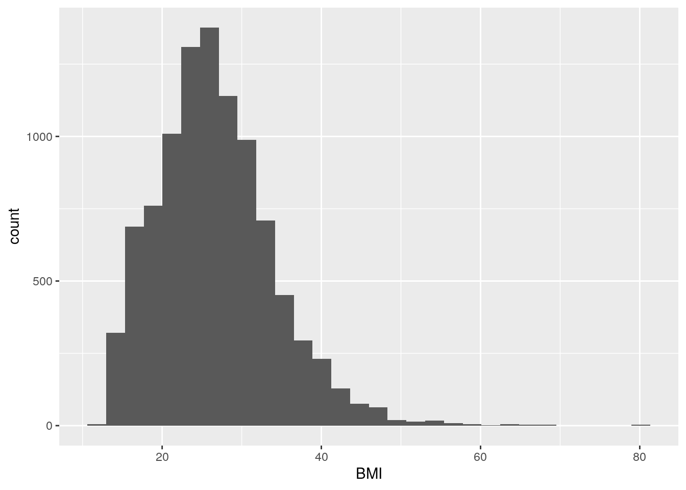
It’s good practice to always create a new line after the +.
We can see that for the most part there is a good distribution with BMI,
though there are several values that are quite large…
some at 80 BMI!
The plots above are for continuous variables,
but what about for discrete?
Well, sadly, there’s really only one: geom_bar().
This isn’t a geom for a barplot though!
This shows the counts of a discrete variable.
There are many discrete variables in NHANES.
Sex is another good variable to examine
and NHANES also has a diabetes variable,
so let’s visualize those.
But first, let’s fix the Gender column to be called Sex,
since it denotes biological sex (presence of a Y chromosome).
# fix sex column header
nhanes_tidied <- NHANES %>%
    rename(Sex = Gender)
Now, let’s visualize them:
# create count barplot for sex
ggplot(nhanes_tidied, aes(x = Sex)) +
geom_bar()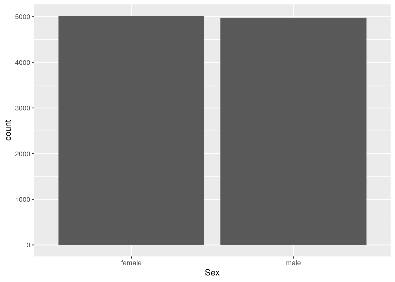 We can see that for the most part there are equal numbers of females and males.
Now to create a count bar plot for diabetes status:
# create count barplot for diabetes status
ggplot(nhanes_tidied, aes(x = Diabetes)) +
    geom_bar()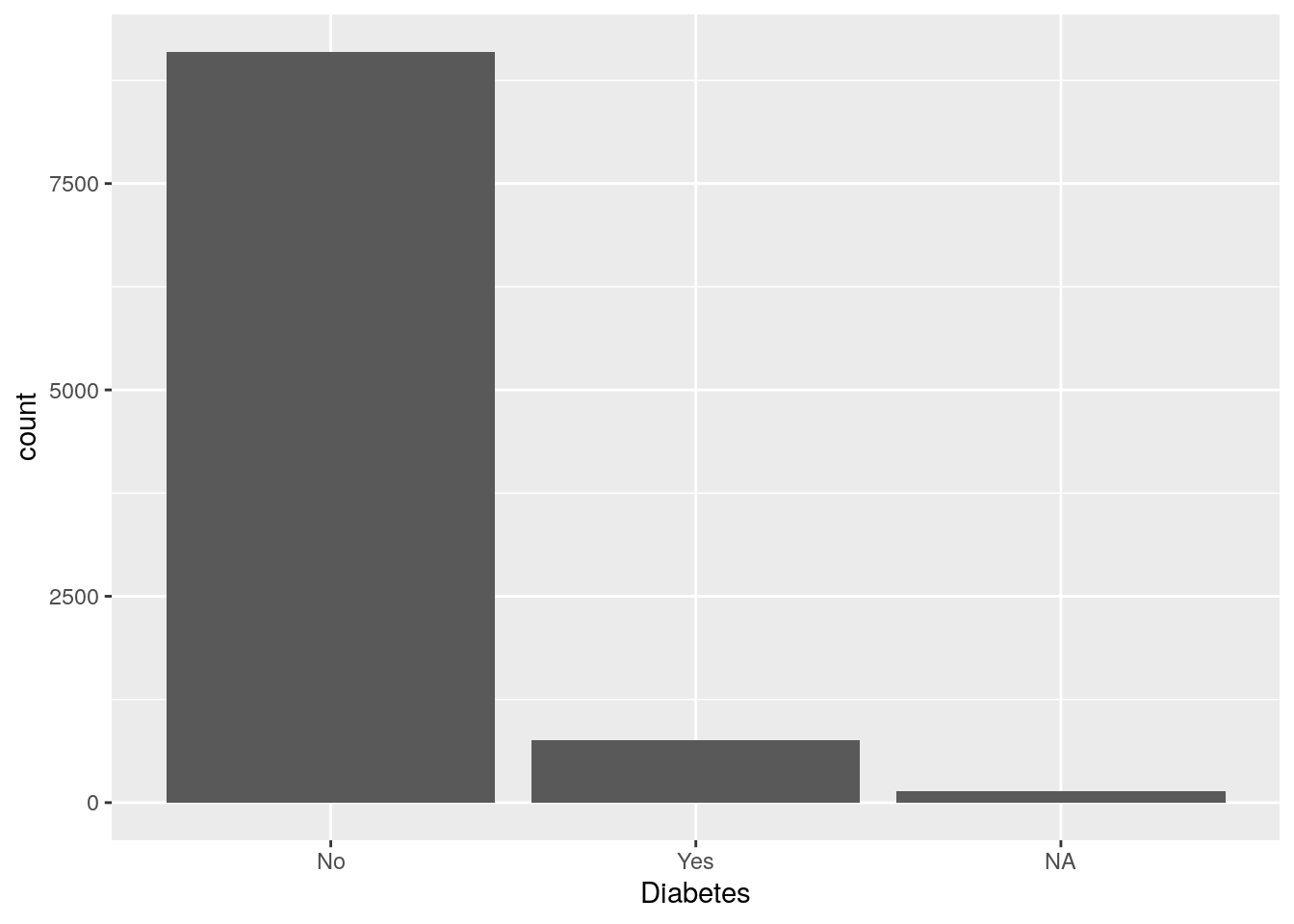
For diabetes, it seems there is some missingness in the dataset. Since diabetes status is an important variable for us, let’s remove all missing values right now.
# remove individuals with missing diabetes status
nhanes_tidied2 <- nhanes_tidied %>%
    filter(!is.na(Diabetes))
Let’s take a minute to talk about the commonly used barplots with mean and error bars. In all cases, bar plots should only be used for discrete (categorical) data where you want to show counts or proportions. They should as a general rule not be used for continuous data. This is because the commonly used “bar plot of means with error bars” actually hides the underlying distribution of the data. To have a better explanation of this, you can read the article on why to avoid barplots after the course. The image below, taken from that paper, shows briefly why this plot type is not useful.
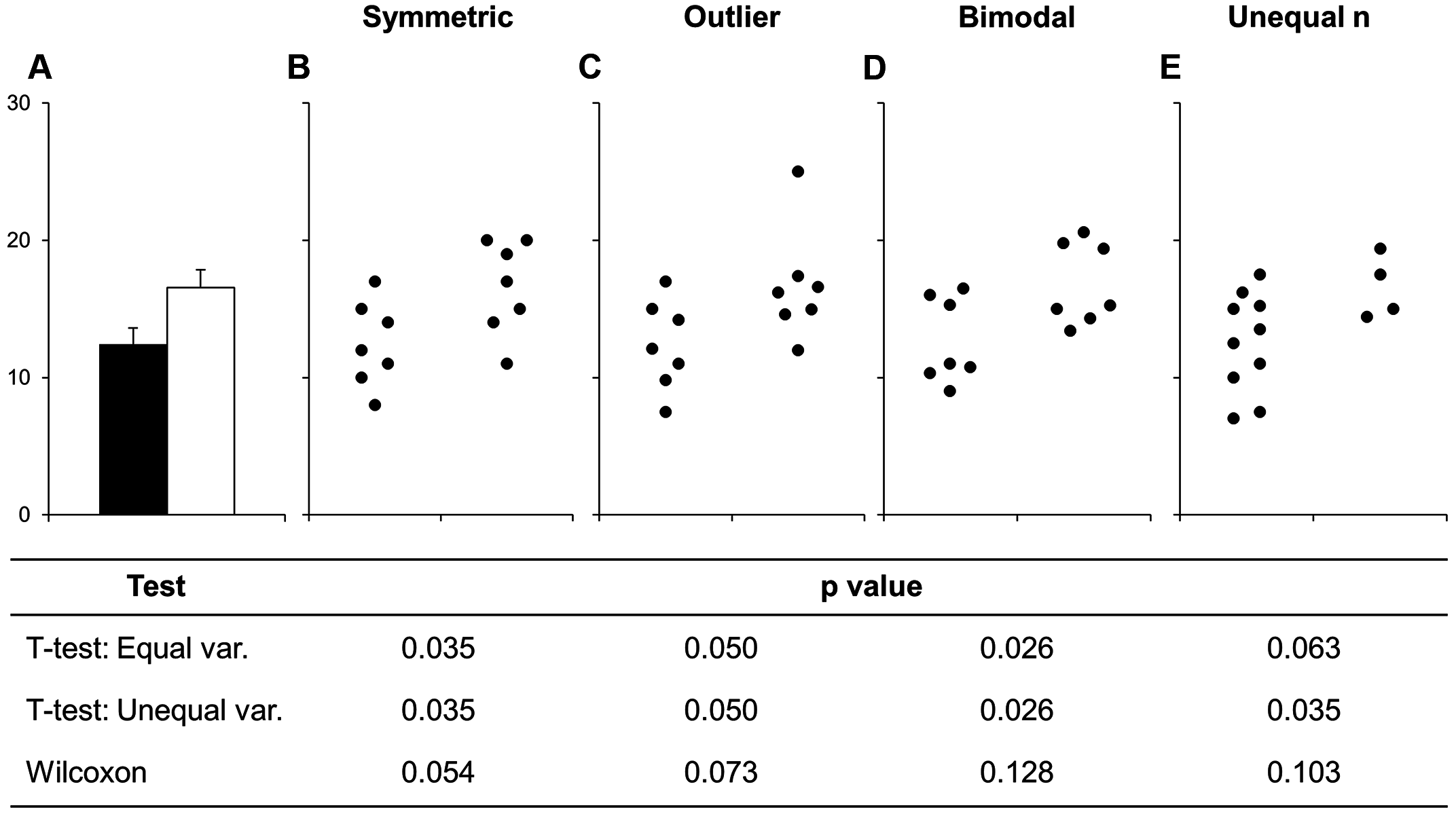
Figure 9.1: Bars deceive what the data actually look like. Image sourced from a PLoS Biology article.
If you do want to create a barplot, you’ll quickly find out that it actually is quite hard to do in ggplot2. The reason it is difficult to create in ggplot2 is by design: it’s a bad plot to use, so use something else.
9.4 Plotting two variables
Next section is about plotting two variables at a time. There are many more types of “geoms” to use when plotting two variables. Which one to choose depends on what you are trying to show or to communicate, and what the data are. Usually the variable that you “control or influence” (the independent variable) in an experimental setting goes on the x-axis, and the variable that “responds” (the dependent variable) goes on the y-axis.
When you have two continuous variables, some geoms are:
geom_point(), which is used to create a standard scatterplotgeom_hex(), which is used to replacegeom_point()when your data is massive, since creating points for each value in a large dataset can take a long time to plotgeom_smooth(), which applies a “regression-type” line to the data (default uses LOESS regression)
Let’s check out how BMI may influence cholesterol using a basic scatterplot, hex plot, and a smoothing line plot:
# Using 2 continuous
bmi_chol <- ggplot(nhanes_tidied2, aes(x = BMI, y = TotChol))
# Standard scatter plot
bmi_chol +
    geom_point()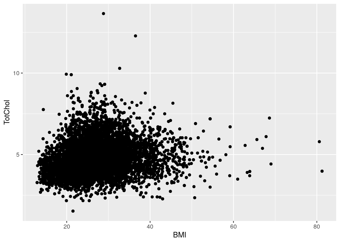
# Standard scatter plot, but with hexagons
bmi_chol +
    geom_hex()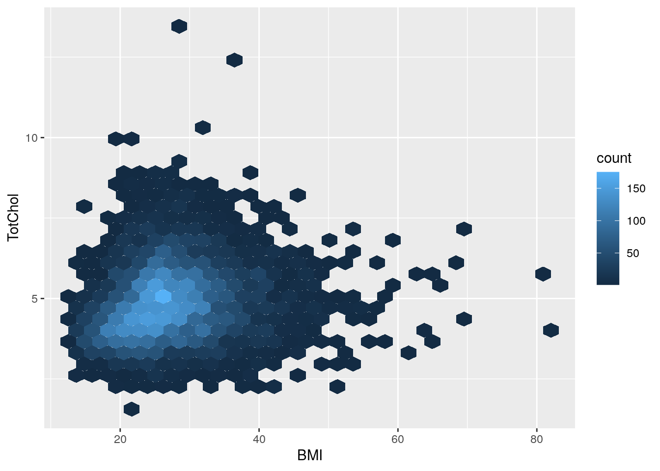
Notice how the hex plot changes the colour of the data based on how many values are in the area of the plot.
# Runs a smoothing line with confidence interval
bmi_chol +
    geom_smooth()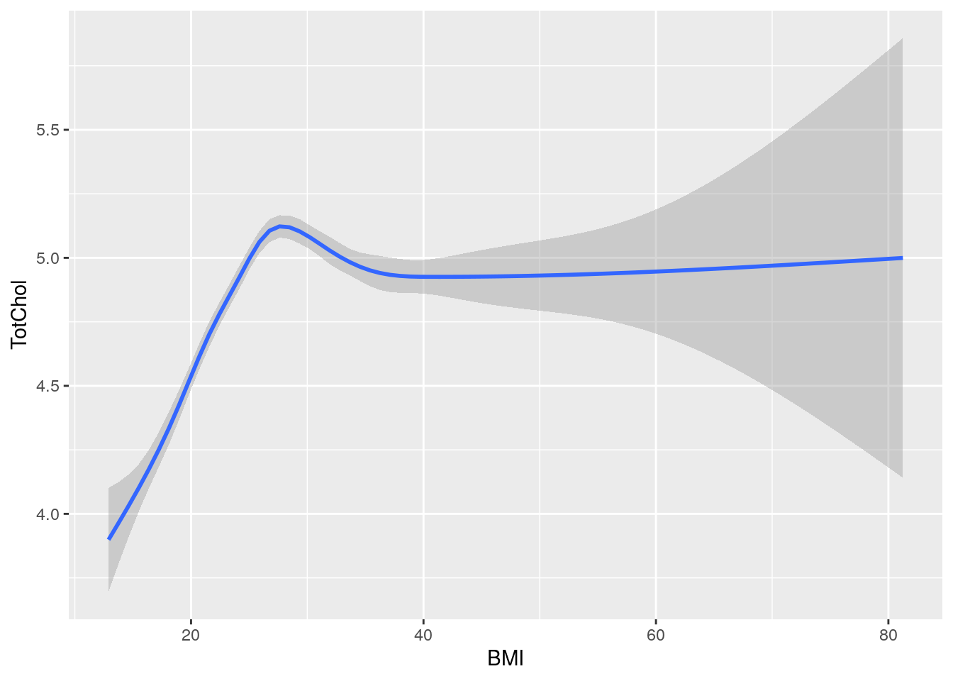
# Or combine two geoms, scatter plot with smoothing line
bmi_chol +
    geom_point() +
    geom_smooth()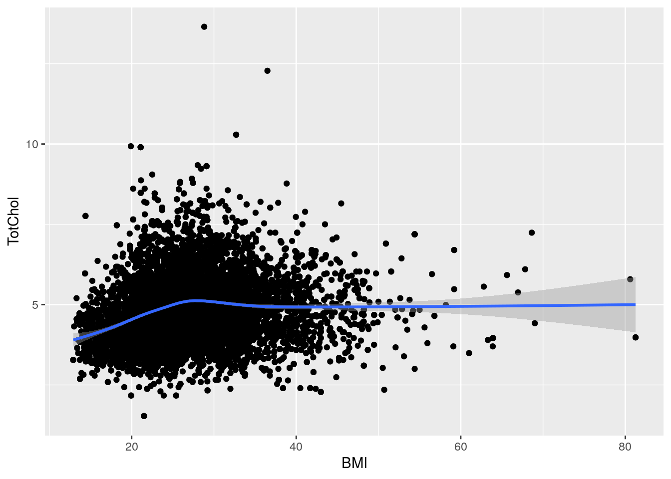
9.4.1 Two discrete variables
Sadly, for two discrete variables,
there are not many options available without major data wrangling.
The most useful geom for this is geom_bar() like before,
but with an added variable.
Because geom_bar() has a “fill” (coloured inside),
we can change that fill based on a variable.
So let’s see what the difference in diabetes status is between sexes.
# 2 categorical/discrete
# (We can pipe data into ggplot)
two_discrete <- nhanes_tidied2 %>%
    ggplot(aes(x = Diabetes, fill = Sex))

# Stacked
two_discrete +
    geom_bar()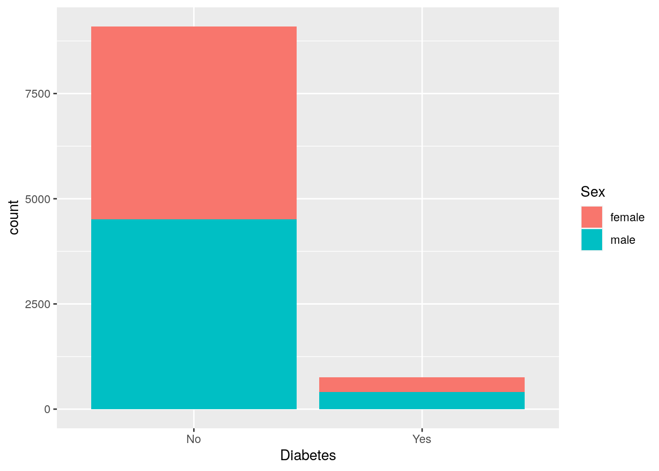
By default, geom_bar() will make fill groups stacked on top of each other.
For this case, it isn’t really that useful.
So let’s instead have them side by side.
For that, we need to use the position argument with a function called
position_dodge().
This new function takes the fill grouping variable and “dodges” them
(moves them) to be side by side.
# "dodged" (side-by-side) bar plot
two_discrete +
    geom_bar(position = position_dodge())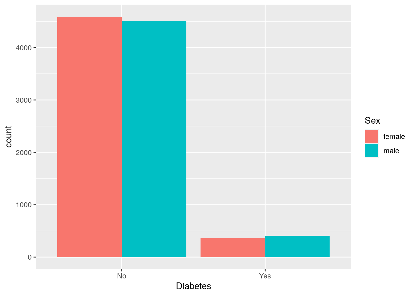
9.4.2 Discrete and continuous variables
When the variable types are mixed (continuous and discrete), there are many more geoms available to use. A couple of good ones are:
geom_boxplot(), which makes boxplots that show the median and a measure of range in the data. Boxplots are generally pretty good at showing the spread of data.geom_jitter(), which makes a type of “scatter” plot, but for discrete and continuous variables. A useful argument togeom_jitter()is calledwidth, which controls how wide the jittered points go out from the center line. This plot is much better than the boxplot since it shows the actual data, and not summaries like a boxplot does. When you have lots of data points however, it isn’t very good.geom_violin(), which shows a density distribution (likegeom_density()). This geom is great when there is a lot of data andgeom_jitter()is just a mass of dots.
Let’s see how BMI differs between those with or without diabetes.
# Using mixed data
two_mixed <- nhanes_tidied2 %>%
    ggplot(aes(x = Diabetes, y = BMI))

# Standard boxplot
two_mixed +
    geom_boxplot()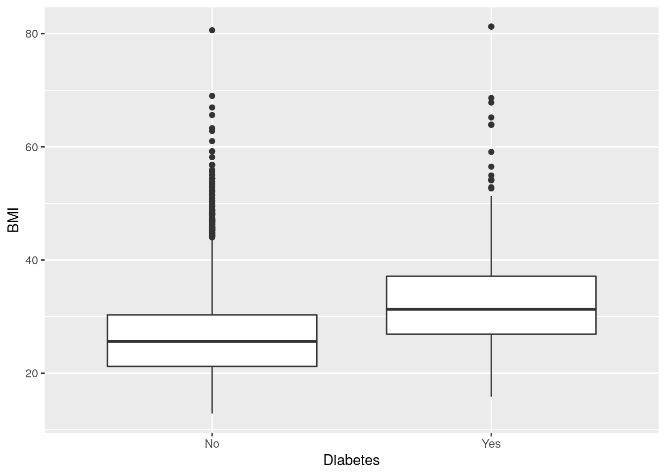
# Better than boxplot, show the actual data!
two_mixed +
    geom_jitter()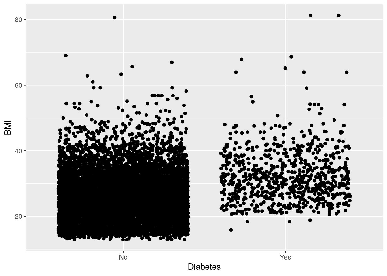
# Give more distance between groups
two_mixed +
    geom_jitter(width = 0.2)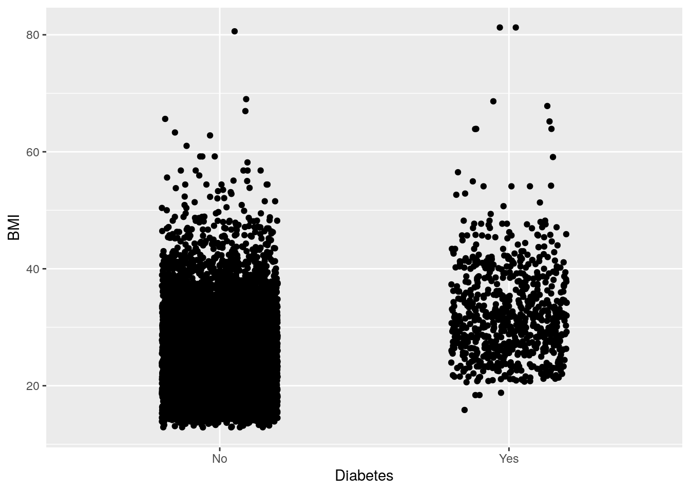
# Show the distribution with a voilin plot
two_mixed +
    geom_violin()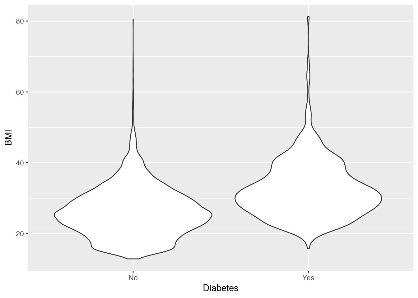
The violin plot kind of looks like two stingrays, eh?
9.5 Exercise: Create plots with one or two variables
Time: 15 min
Create an exercise script by typing in the Console usethis::use_r("exercises-visualization").
Copy and paste the below code into that script.
Complete as many tasks as you can below.
- Like we did above, remove individuals that have missing diabetes status
and rename the
Gendercolumn toSex. Reminder, use!to invert a logic condition (fromTRUEtoFALSEand vice versa, e.g. for keeping non-missing). We do this again in this script to make the script self-contained. - Using
geom_histogram(), find out what the distribution is for the two variables below.Age(participant’s age at collection)DiabetesAge(age of diabetes diagnosis)
- Using
geom_bar(), find out how many people have data recorded for each of these discrete variables. What can you say about most people for these variables?SmokeNow(current smoking status)PhysActive(does moderate to vigorous physical activity)
- Using
geom_hex(), find out how BMI relates to the two blood pressure variables. What is the most common BMI and blood pressure combination? Do you notice anything about the data from the plots?BPSysAve(average systolic blood pressure)BPDiaAve(average diastolic blood pressure)
- Using
geom_bar(), find out howPhysActivethose with or withoutDiabetesare. PutDiabeteson the x-axis. What can you say based on the data? Note the differences in missingness between groups. Don’t forget to useposition_dodge()in thepositionargument, in order to arrange the bars side by side. - Using
geom_violin(), find howPovertylevels are different for those with or withoutDiabetes. PutDiabeteson the x-axis. Looking at the distributions, what can you conclude about how poverty may be associated with diabetes status?- The
Povertyvariable is calculated as a ratio between income and a poverty threshold. Smaller numbers mean higher poverty.
- The
# 1. Remove missing diabetes, rename to Sex
nhanes_tidy <- NHANES %>%
    # Filter rows
    ___(___(___)) %>%
    # Rename column
    ___(___ = ___)

# 2a. Distribution of Age
ggplot(___, aes(x = ___)) +
    ___()

# 2b. Distribution of DiabetesAge
ggplot(___, aes(x = ___)) +
    ___()

# 3a. Number of people who SmokeNow
ggplot(___, aes(x = ___)) +
    ___()

# 3a. Number of people who are PhysActive
ggplot(___, aes(x = ___)) +
    ___()

# 4a. BMI relation to systolic blood pressure
ggplot(___, aes(x = ___, y = ___)) +
    ___()

# 4b. BMI relation to diastolic blood pressure
ggplot(___, aes(x = ___, y = ___)) +
    ___()

# 5. Physically active people with or without diabetes
ggplot(___, aes(x = ___, fill = ___)) +
    ___(___ = ___())

# 6. Poverty levels between those with or without diabetes
ggplot(___, aes(x = ___, y = ___)) +
    ___()
Click for a possible solution
# 1. Remove missing diabetes, rename to Sex
nhanes_tidy <- NHANES %>%
    # Filter rows
    filter(!is.na(Diabetes)) %>%
    # Rename column
    rename(Sex = Gender)

# 2a. Distribution of Age
ggplot(nhanes_tidy, aes(x = Age)) +
    geom_histogram()

# 2b. Distribution of DiabetesAge
ggplot(nhanes_tidy, aes(x = DiabetesAge)) +
    geom_histogram()

# 3a. Number of people who SmokeNow
ggplot(nhanes_tidy, aes(x = SmokeNow)) +
    geom_bar()

# 3a. Number of people who are PhysActive
ggplot(nhanes_tidy, aes(x = PhysActive)) +
    geom_bar()

# 4a. BMI relation to systolic blood pressure
ggplot(nhanes_tidy, aes(x = BMI, y = BPSysAve)) +
    geom_hex()

# 4b. BMI relation to diastolic blood pressure
ggplot(nhanes_tidy, aes(x = BMI, y = BPDiaAve)) +
    geom_hex()

# 5. Physically active people with or without diabetes
ggplot(nhanes_tidy, aes(x = Diabetes, fill = PhysActive)) +
    geom_bar(position = position_dodge())

# 6. Poverty levels between those with or without diabetes
ggplot(nhanes_tidy, aes(x = Diabetes, y = Poverty)) +
    geom_violin()
9.6 Visualizing three or more variables
There are many many ways to visualize additional variables in a plot and further explore your data. We can use ggplot’s colour, shape, size, transparency (“alpha”), and fill aesthetics, as well as “facets”. Faceting in ggplot2 is a way of splitting the plot up into multiple plots when the underlying aesthetics are the same or similar. In this section, we’ll be covering many of these capabilities in ggplot2.
The most common and “prettiest” way of adding a third variable is by using colour. Let’s try to answer a few questions, to visualize some examples:
Question: Is systolic blood pressure different in those with
or without diabetes in females and males?
In this case, we have one continuous variable (BPSysAve)
and two discrete (Sex and Diabetes).
For this plot, we could use geom_boxplot().
# Plot systolic blood pressure in relation to sex and diabetes status
nhanes_tidied2 %>%
    ggplot(aes(x = Sex, y = BPSysAve, colour = Diabetes)) +
    geom_boxplot()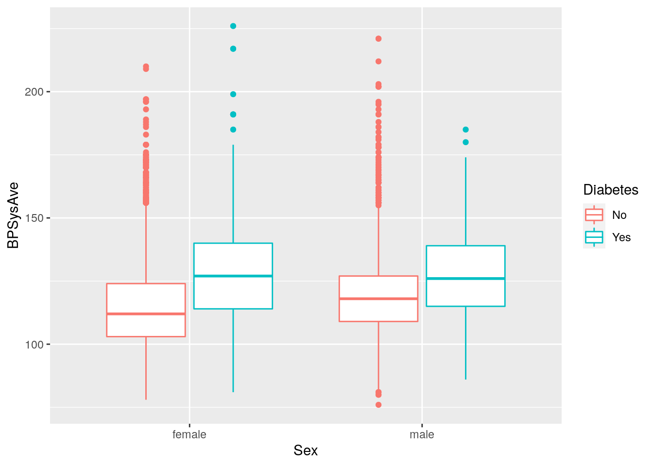
Question: How does BMI relate to systolic blood pressure
and age?
Here we have three continuous variables (BMI, BPSysAve, and Age),
so we could use geom_point().
# Plot BMI in relation to systolic blood pressure and age
nhanes_tidied2 %>%
    ggplot(aes(x = BMI, y = BPSysAve, colour = Age)) +
    geom_point()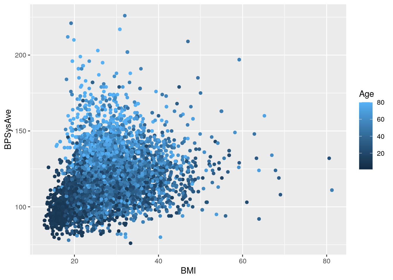
Question: How does BMI relate to systolic blood pressure
and what is different between those with and without diabetes?
In this case, we have two continuous and one discrete variable (Diabetes).
We could use geom_point():
# Plot BMI in relation to systolic blood pressure and diabetes status
nhanes_tidied2 %>%
    ggplot(aes(x = BMI, y = BPSysAve, colour = Diabetes)) +
    geom_point()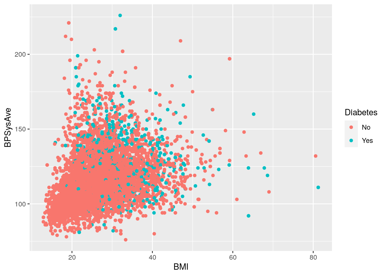
For this plot it’s really hard to see what’s different.
But there is another way of visualizing a third (or fourth, and fifth!) variable:
with “faceting”.
Faceting splits the plot up into multiple subplots
using the function facet_grid().
To work, at least one of the first two arguments to facet_grid() are needed.
The first two are:
cols: The discrete variable to use to facet the plot column-wise (i.e. side-by-side)rows: The discrete variable to use to facet the plot row-wise (i.e. stacked on top of each other)
For both cols and rows, the variable given must be wrapped by vars()
(e.g. vars(Diabetes)).
Let’s try it with the previous example (instead of using colour).
# Plot BMI in relation to systolic blood pressure and diabetes status using faceting
nhanes_tidied2 %>%
    ggplot(aes(x = BMI, y = BPSysAve)) +
    geom_point() +
    facet_grid(cols = vars(Diabetes))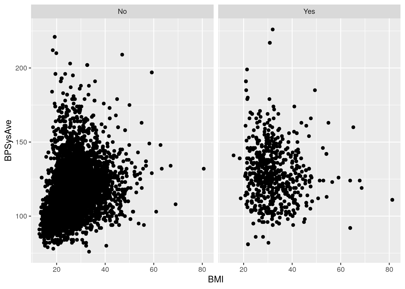
We can also stack by SurveyYr and use Age as a colour:
# Plot BMI in relation to systolic blood pressure, age, survey year and diabetes status using faceting
nhanes_tidied2 %>%
    ggplot(aes(x = BMI, y = BPSysAve, colour = Age)) +
    geom_point() +
    facet_grid(cols = vars(Diabetes),
               rows = vars(SurveyYr))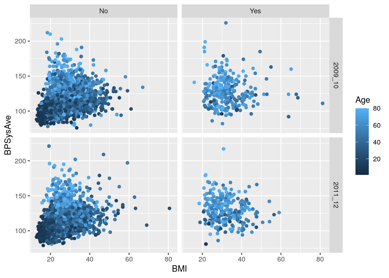
9.7 Colours: Make your graphs more accessible
Colour blindness is common in the population, with red-green colour blindness in particular affecting about 8% of men and 0.5% of women. So to make your graph more accessible to people with colour blindness, you need to consider the colours you use. For more detail on how colours look to those with colour-blindness, check out this documentation from the viridis package. The viridis colour scheme (also developed as an R package) was specifically designed to represent data to all colour visions (including as a grayscale, e.g. from black to white). There is a really good, informative talk on YouTube on this topic.
When using colours, think about what you are trying to convey in your figure and how your choice of colours will be interpreted. You can use built-in colour schemes or create your own. For now, let’s stick to using built-in ones. There are two: the viridis and the ColorBrewer colour schemes. Both are well designed and are colour-blind friendly. For this course we will only cover the viridis package. Let’s make a base plot object to work from, with two discrete variables:
# Barplot to work from, with two discrete variables
base_barplot <- nhanes_tidied2 %>%
    ggplot(aes(x = Diabetes, fill = Sex)) +
    geom_bar(position = position_dodge())
We’ll be using the scale_ functions for this.
There are many of these functions and they all have a consistent naming:
scale_AES_SETTING().
For instance,
we are using fill, so it would be scale_fill_.
And since we are using the viridis scheme,
it would continue to: scale_fill_viridis.
Lastly, because we have discrete variables,
we need to tell viridis by adding a _d (for discrete) to the end:
scale_fill_viridis_d().
This function has several color schemes within it, which
we can choose by using the options argument (it goes from "A" to "E").
# change colors to a viridis color scheme
base_barplot +
    scale_fill_viridis_d()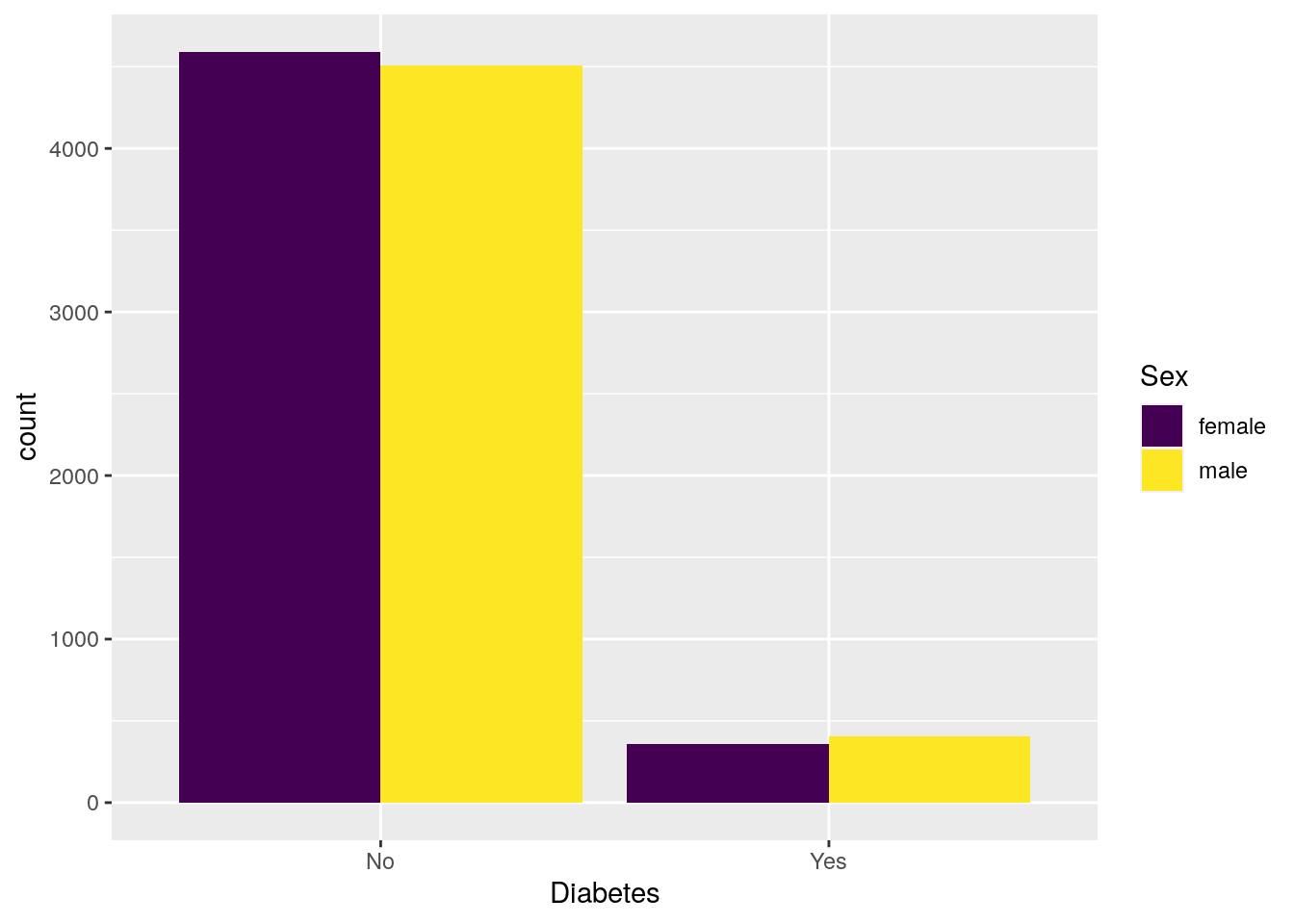
# change colors to another viridis color scheme
base_barplot +
    scale_fill_viridis_d(option = "A")
To use the colour schemes on a continuous variable,
we would have to do a few things.
First, we’d most likely be using the colour aesthetic,
which means the scale would be scale_colour_.
To tell viridis to use the continuous scale,
we’d add a _c so it would be: scale_colour_viridis_c().
# scatterplot to work from, with two continuous variables
base_scatterplot <- nhanes_tidied2 %>%
    ggplot(aes(x = BMI, y = BPSysAve, colour = Age)) +
    geom_point()
# change colors to a viridis color scheme
base_scatterplot +
    scale_color_viridis_c()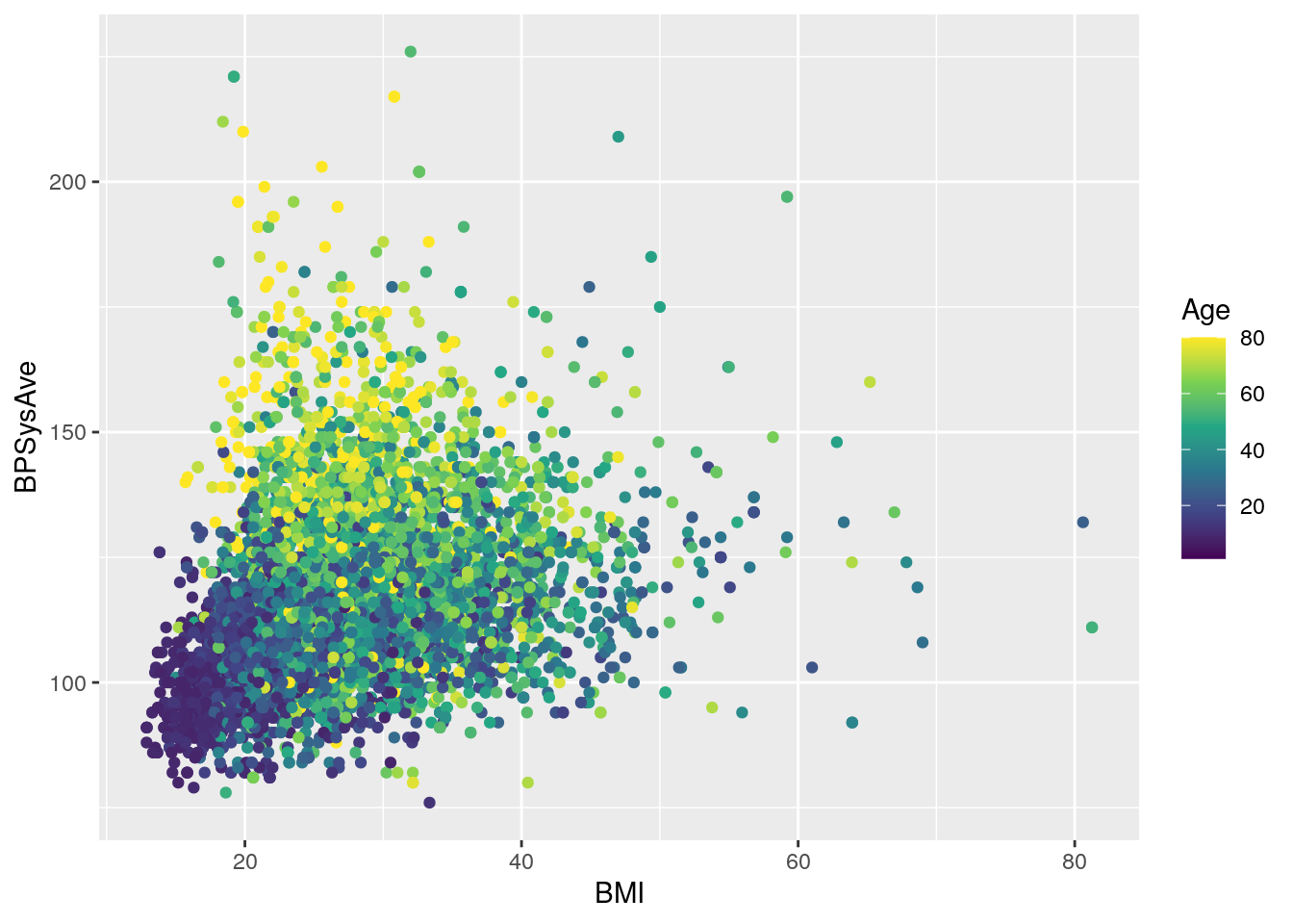
# change colors to another viridis color scheme
base_scatterplot +
    scale_color_viridis_c(option = "C")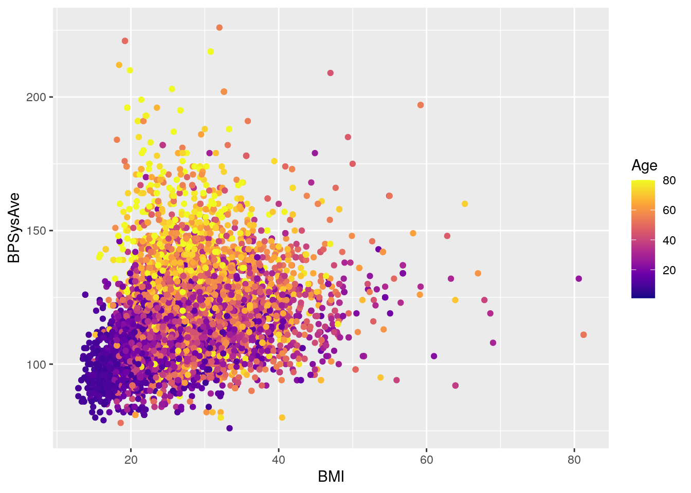
9.8 Titles, axis labels, and themes
There are so so so many options to modify a ggplot2 figure.
Almost all of them are found in the theme() function.
We won’t cover individual theme items,
since the help with ?theme
and the ggplot2 theme webpage already document theme() really well.
So we’ll instead cover a few of the built-in themes,
as well as setting the axes labels and plot title.
We’ll build off of the previously created base_scatterplot.
All built-in themes start with theme_.
# create scatterplot to play with themes
base_scatterplot2 <- base_scatterplot +
    facet_grid(cols = vars(Diabetes),
               rows = vars(Sex)) +
    scale_color_viridis_c()

# Some pre-defined themes
base_scatterplot2 + theme_bw()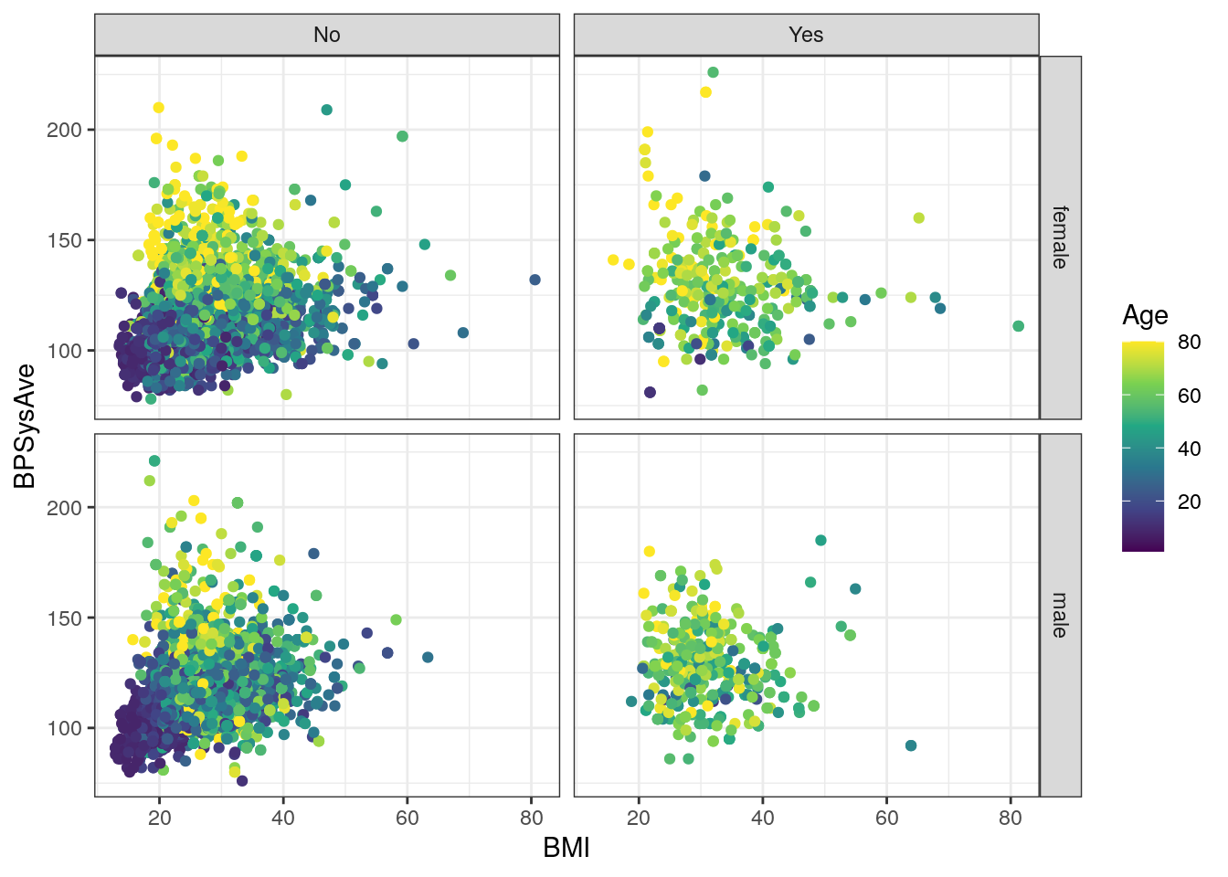
base_scatterplot2 + theme_minimal()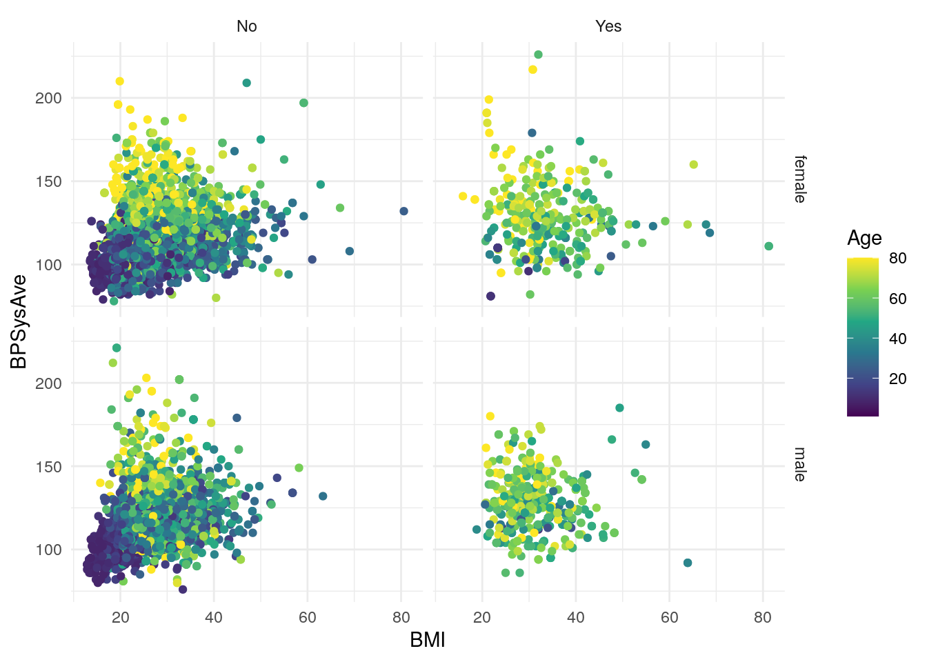
base_scatterplot2 + theme_classic()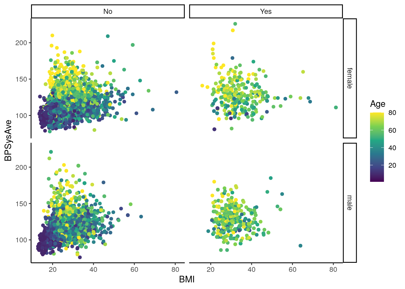 You can also set the theme for all subsequent plots, by using the
 theme_set() function, specifying the theme you want in the parenthesis.
# set the theme for all subsequent plots
theme_set(theme_bw())
For adding labels to things, such as axis titles, the function is labs().
To change the y-axis title, use the y argument in labs().
For the x-axis, it is x.
For the whole plot, it is title:
# add plot title, and change x and y axis titles
base_scatterplot2 +
    labs(title = "BMI, systolic blood pressure, and age by diabetes and sex.",
         y = "Systolic Blood Pressure (mmHg)",
         x = "BMI (kg/m2)")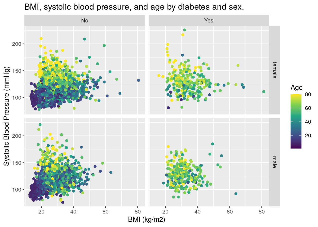
9.9 Saving the plot
Finally, to save the plot you created, use the ggsave() function.
The first argument says where to save the graph:
Give the name of the newly created file,
as well as the folder location (separate folders with /.
The next argument is the plot you want to save.
To set the dimensions of the figure,
use width and height arguments.
But first, we need to create the doc/images/ folder.
We can do this with the fs (for “filesystem”) package:
fs::dir_create("doc/images")Ok, now let’s save that figure!
# save the plot
ggsave(here::here("doc/images/scatterplot.pdf"),
       base_scatterplot2, width = 7, height = 5)
9.10 Final exercise: Group work
Time: 30 min
In your groups, start exploring your data by making ggplot2 graphs. Ultimately, your goal as a group is to complete item 6 of the assignment. It’s a good idea to distribute exploration to each group member, so that each member gets practice making ggplot2 graphs. Take about 10-15 min to do these tasks:
- Each member creates an R script in the
R/folder to start visually exploring the data. Name these new files with your name and-exploring.R. - Add, commit, and push these files to your GitHub repository.
- Find some visually interesting and insightful plots are that you could show in the presentation and in the report.
Then with the remaining time, as a group:
- Decide which graphs to include in the report and presentation.
- Complete item 6 of the assignment by creating an R script that will create those figures.
- Add, commit, and push the new file to GitHub.
- Save these figures in the
doc/images/folder. - Add, commit, and push the images to GitHub.